Three29 — selected UX/UI work
Websites and mobile apps I designed as a UX/UI designer at Three29, a design-and-development studio in Sacramento — for a national nonprofit, local landmarks, a sushi institution and a couple of startups.
The studio years
Before going independent, I worked at Three29 as a UX/UI designer. The projects ran the full arc — card sorts and sitemaps, wireframes, then high-fidelity UI — across responsive websites and iOS/Android apps. A selection is below. The visuals are recovered from Three29's archived case studies, so a few survive only at lower resolution.
Maranatha — nonprofit website
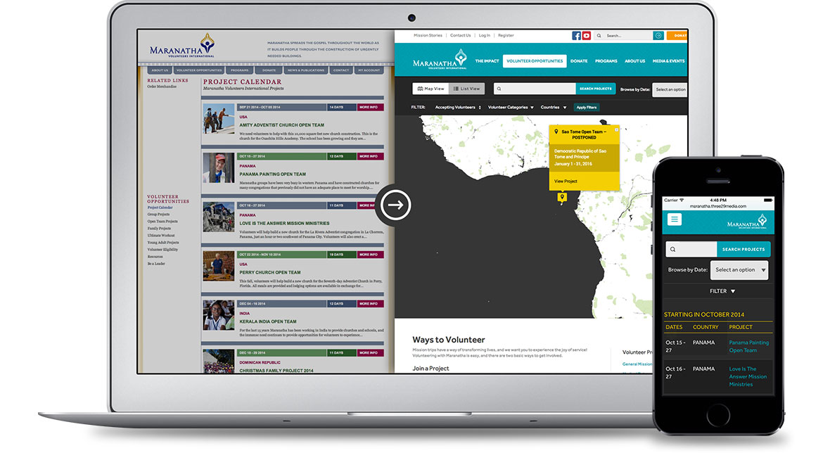
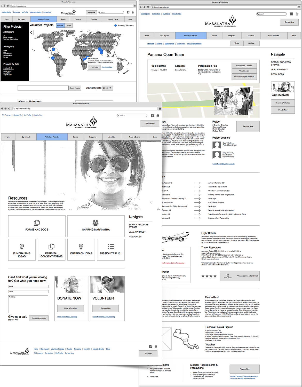
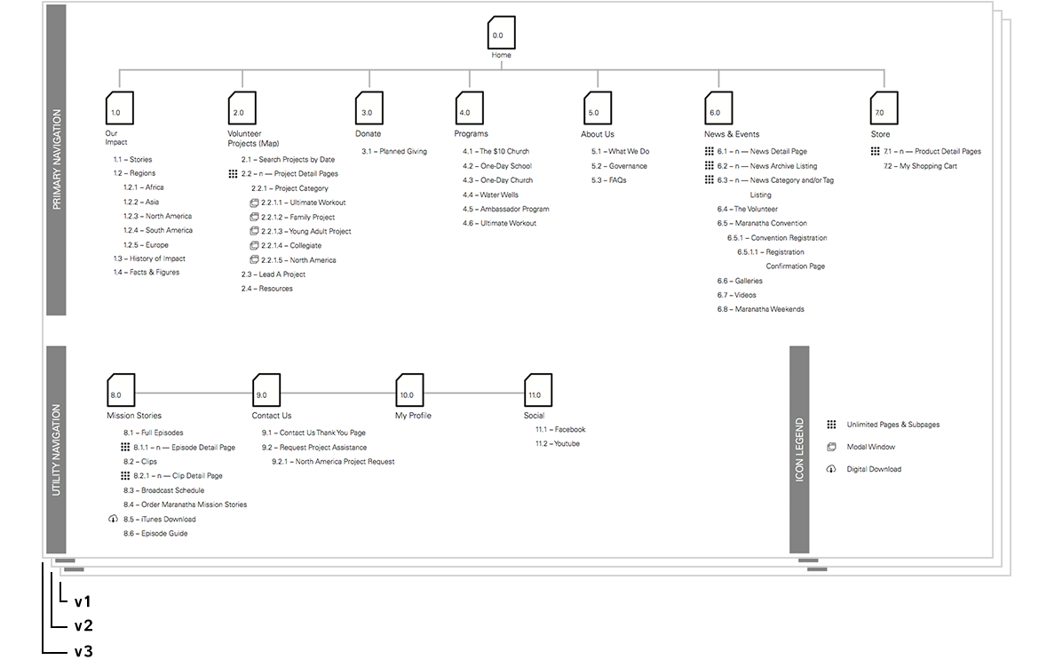
Website · 2014A volunteer-and-donation nonprofit had outgrown a static site organised around its own internal structure rather than its visitors. I ran card-sorting to rebuild the information architecture around donors and volunteers, produced the sitemap and wireframes, then designed a warmer, lighter UI across desktop and mobile — including a mobile-first rework of the project-opportunities map, so people can sign up to serve from anywhere.
Extreme Engineering — website
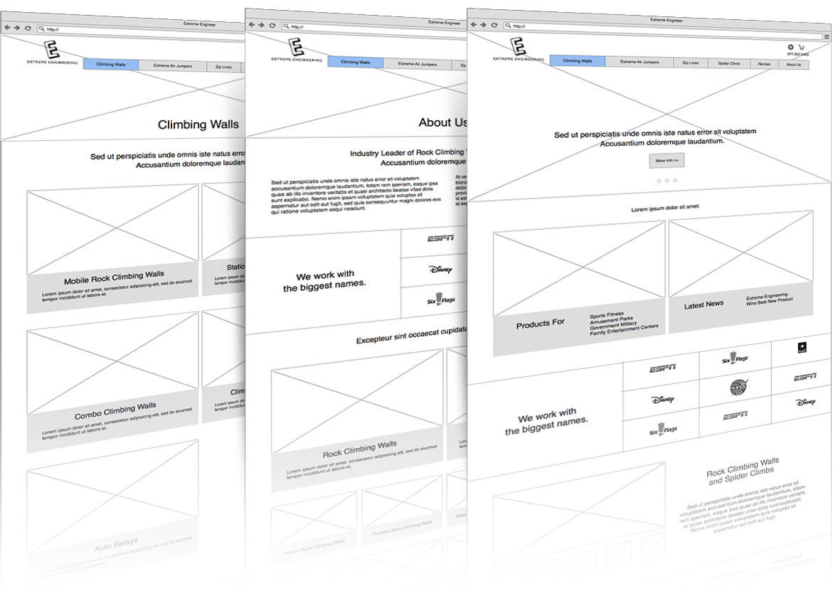
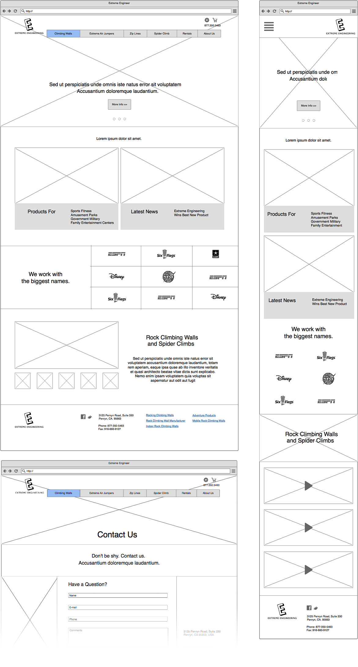
Website · 2014A maker of zip lines and adventure attractions had an e-commerce-style site that buried the products and the fun. I wireframed and designed a bolder, responsive site built around big imagery and playful iconography — engineered to hold up from 320 to 1400px, including oversized hero banners that had to reflow cleanly on mobile.

Mikuni — restaurant website
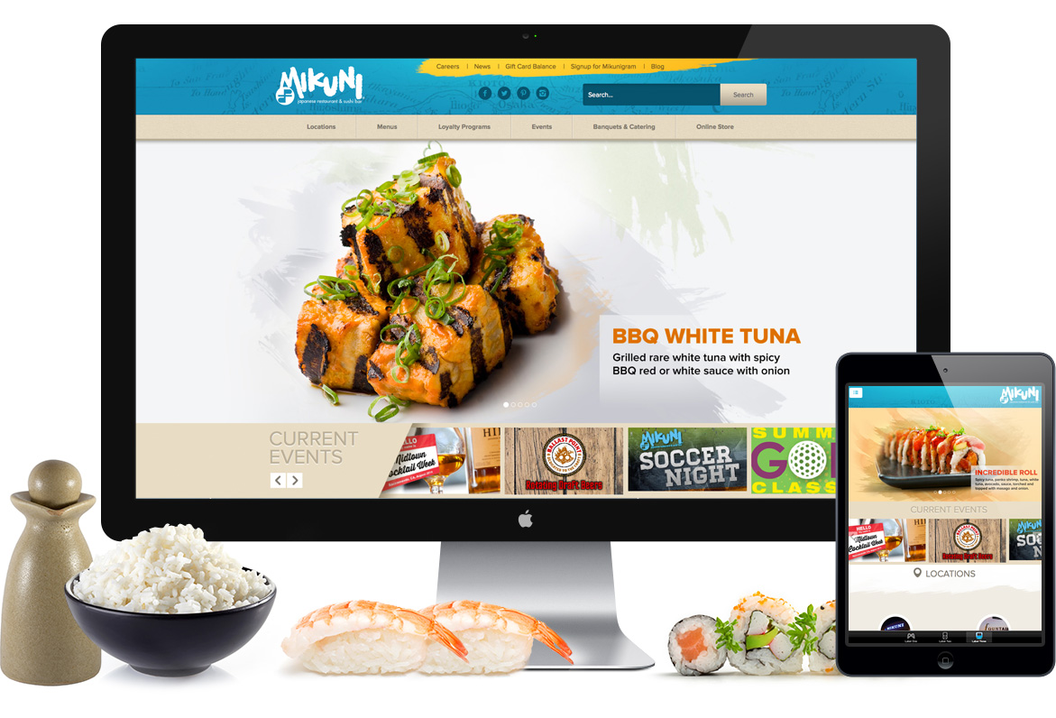
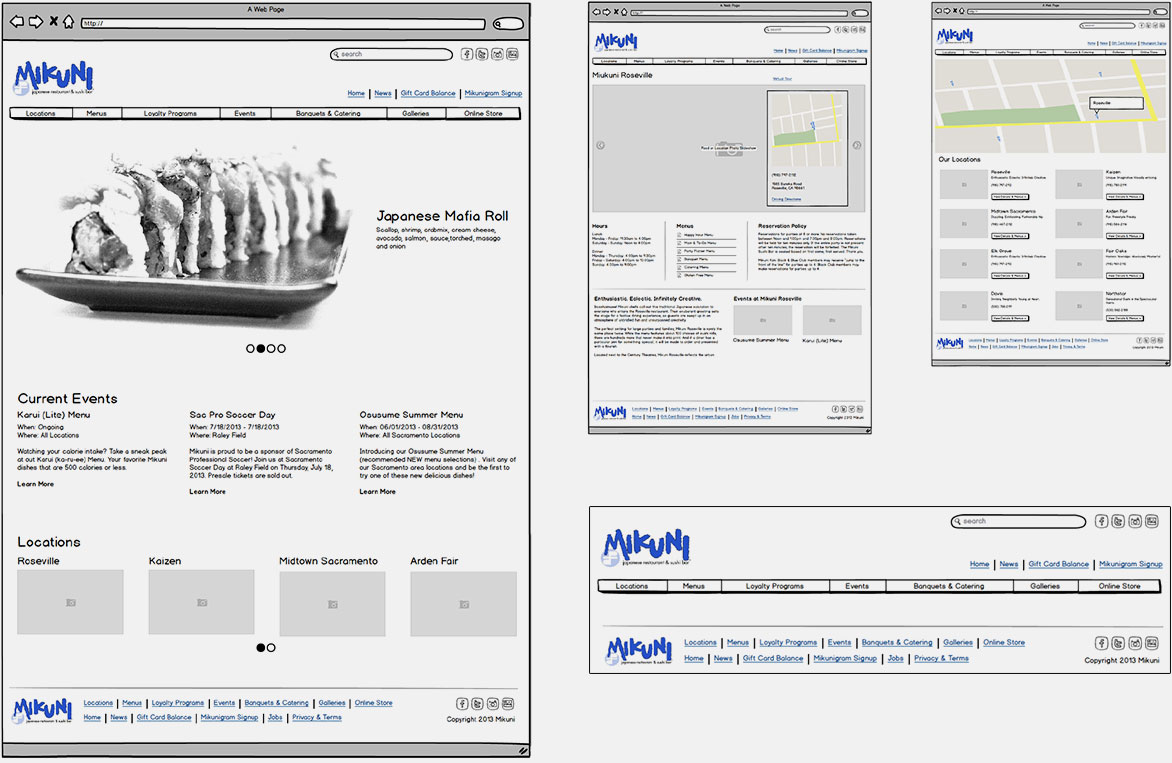
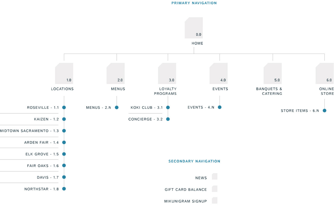
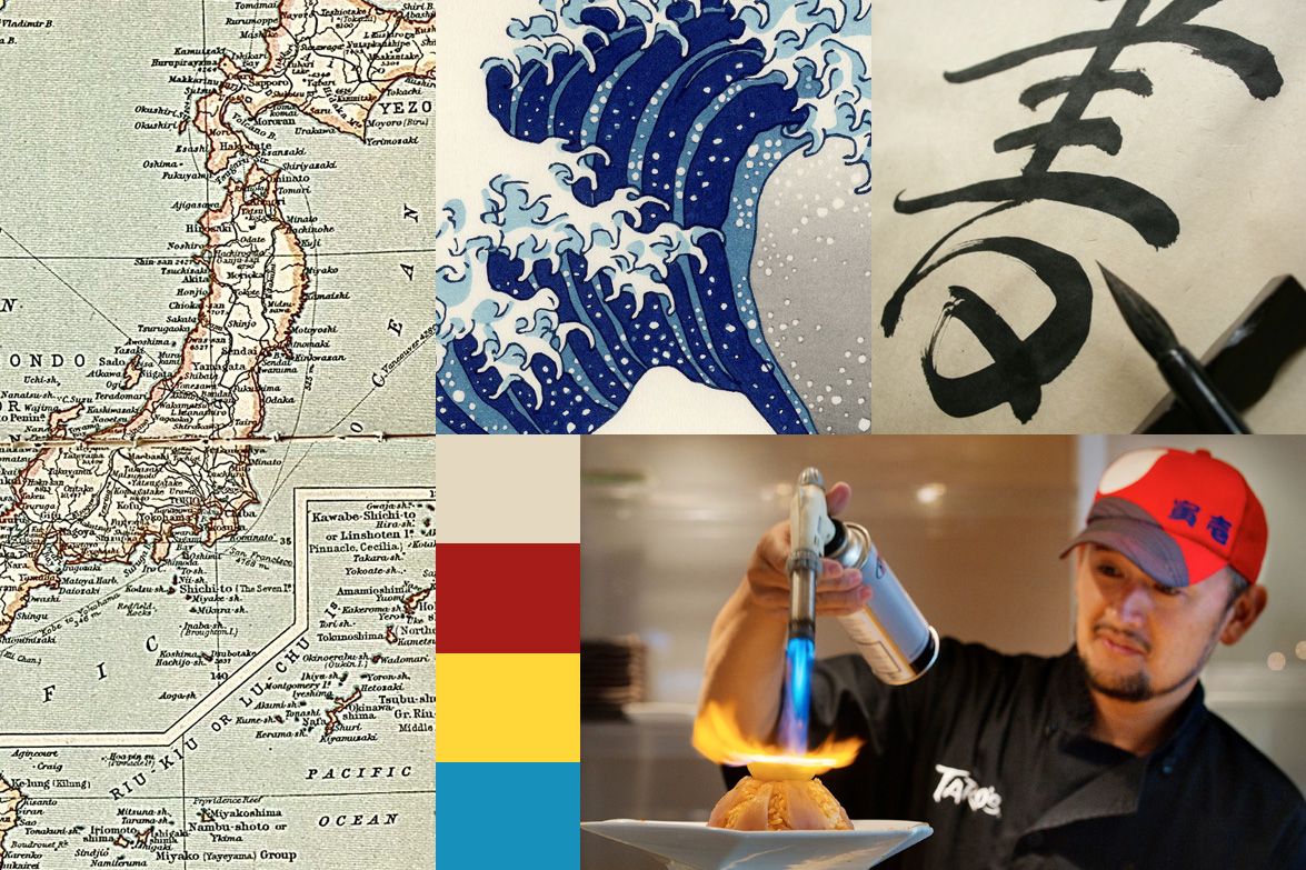
Website · 2014A beloved Sacramento sushi group with a brand to guard closely — the logo stays whole, and it's never written with an apostrophe-s. After an on-site visit and a custom photo shoot, I built the sitemap and wireframes and designed a site drawing on Japanese prints, lettering and colour. Two directions were pitched internally; the client merged them into the final design.
Old Sacramento — mobile app
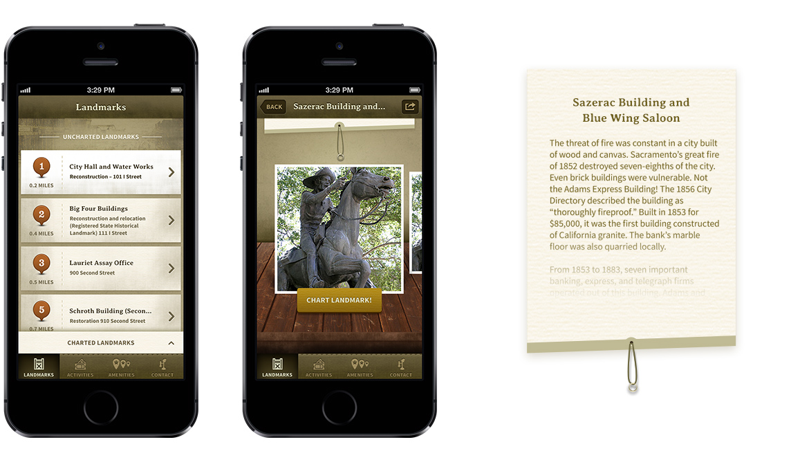
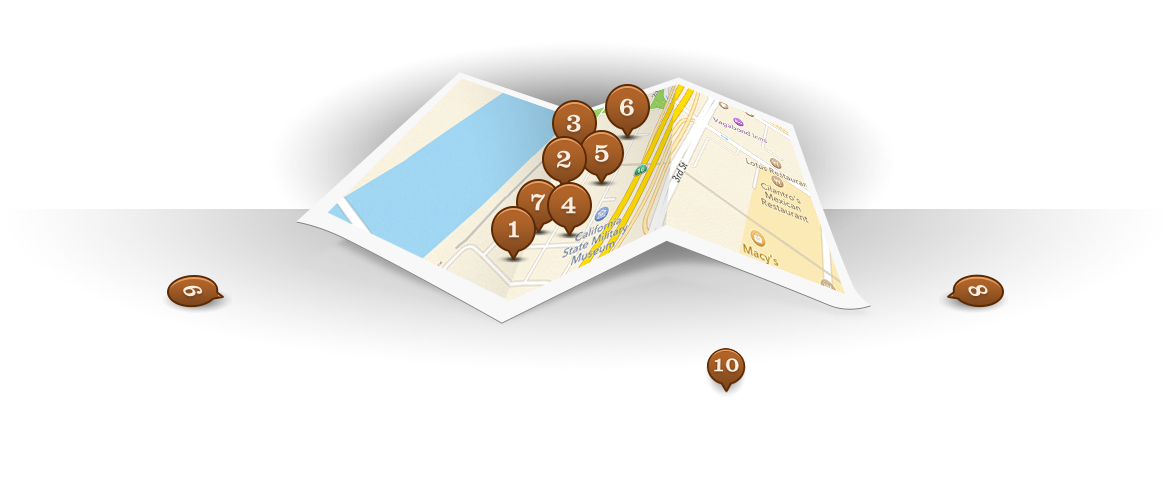
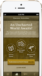
iOS & Android · 2015The Sacramento History Museum wanted a tourism app that felt true to Old Sacramento's history while running on modern phones and GPS. I designed a map-based discovery experience and a landmarks browser rich with local history, alongside a low-cost activity pack — trivia, guided tours and coupons — that pulled in nearby businesses.
Swiggler — nightlife app
iOS & Android · 2015A nightlife startup came to the studio to relaunch its app with a new direction and identity. I worked with the founders to shape the feature set, then wireframed every screen for a smooth, playful interface while the team explored a fresh brand.
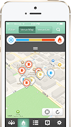
Only a small archived thumbnail of the app survives — the full-resolution screens weren't captured in the web archive.