Coffee Cart Boys — website & design system
A complete website design and design system for a mobile barista-cart catering company serving corporate events, weddings and craft services across LA & Orange County.
The brief
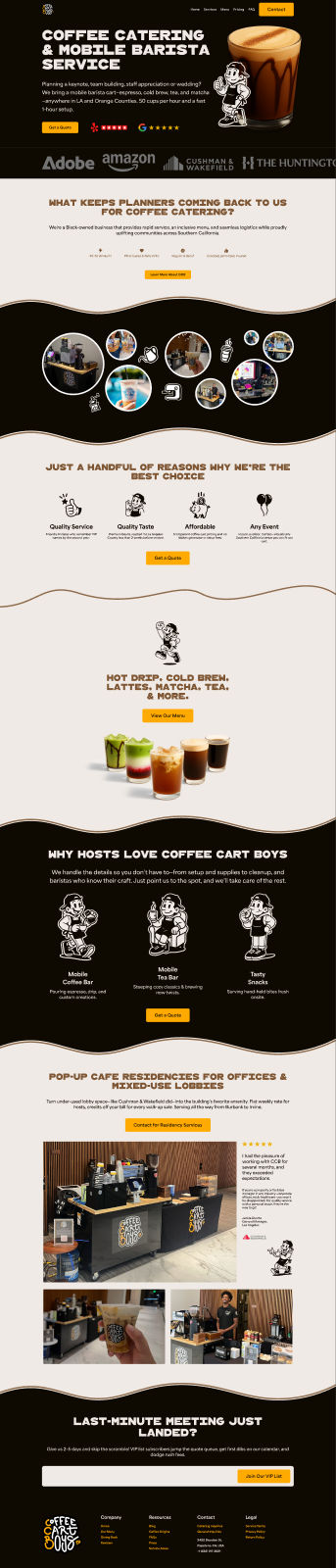
Coffee Cart Boys needed a site that sells the experience — premium, characterful and unmistakably theirs — and turns event browsers into enquiries. The work was two halves: a reusable design system so every page stays consistent, and the page designs to build the site from. The brand voice is doing real work throughout:
“We bring a mobile barista cart — espresso, cold brew, tea, and matcha — anywhere in LA and Orange Counties. 50 cups per hour and a fast 1-hour setup.”
The design system
Built on tokens, not one-offs — a structured set of Color/, Typography/, Base Units spacing and per-component values (right down to the gold primary button). Warm and appetising: a near-black mocha canvas, cream type, and a single confident gold accent.
The site
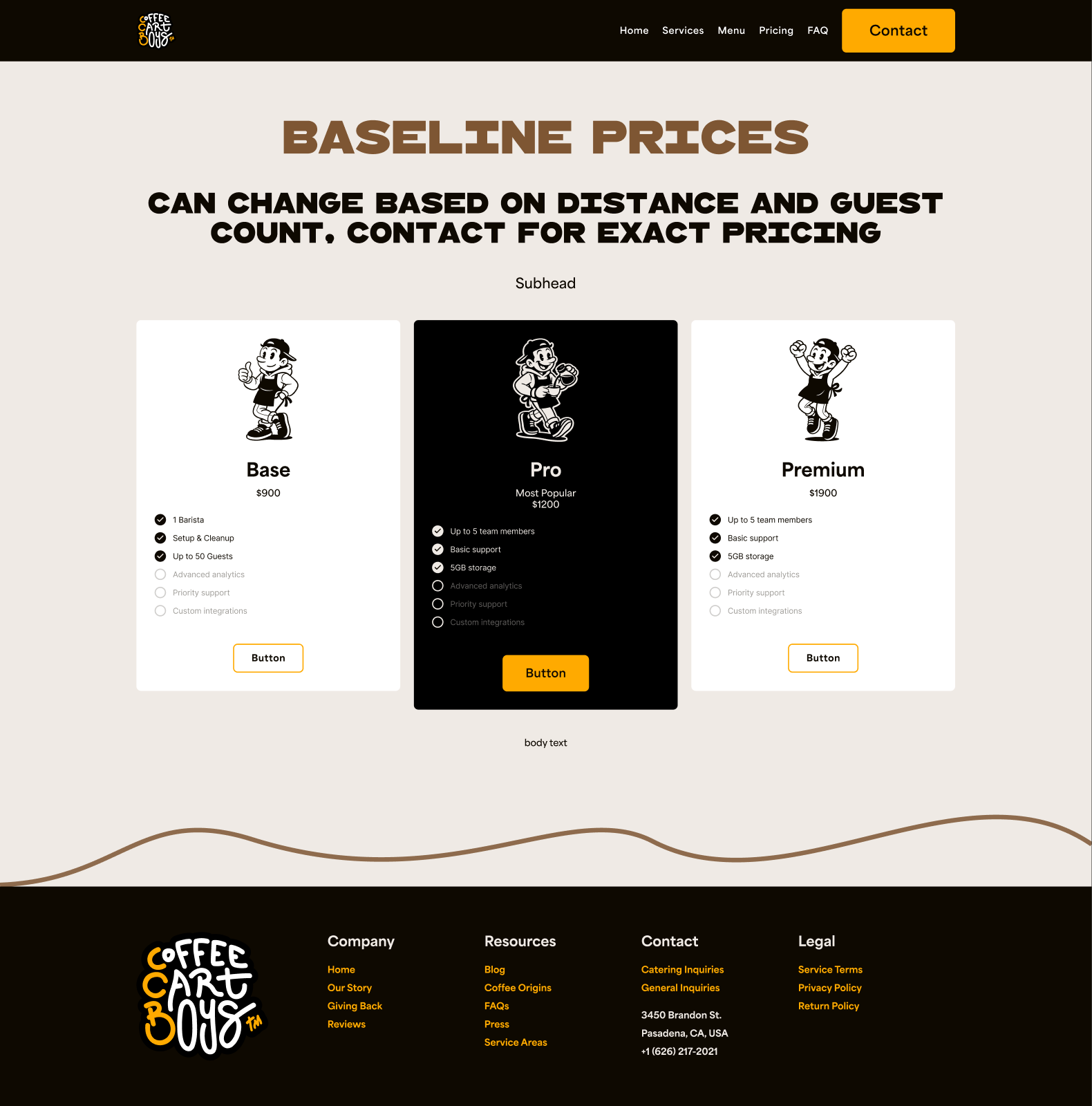
A full marketing site designed responsively (desktop + mobile): a converting homepage, a complete catering menu, a pricing page, a blog/content system, and a kit of interior-page templates (centered, left, and left-with-sidebar layouts) so new pages can be assembled quickly.

Brand in the wild — menu boards
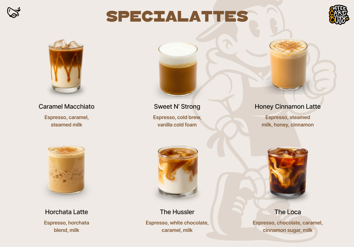
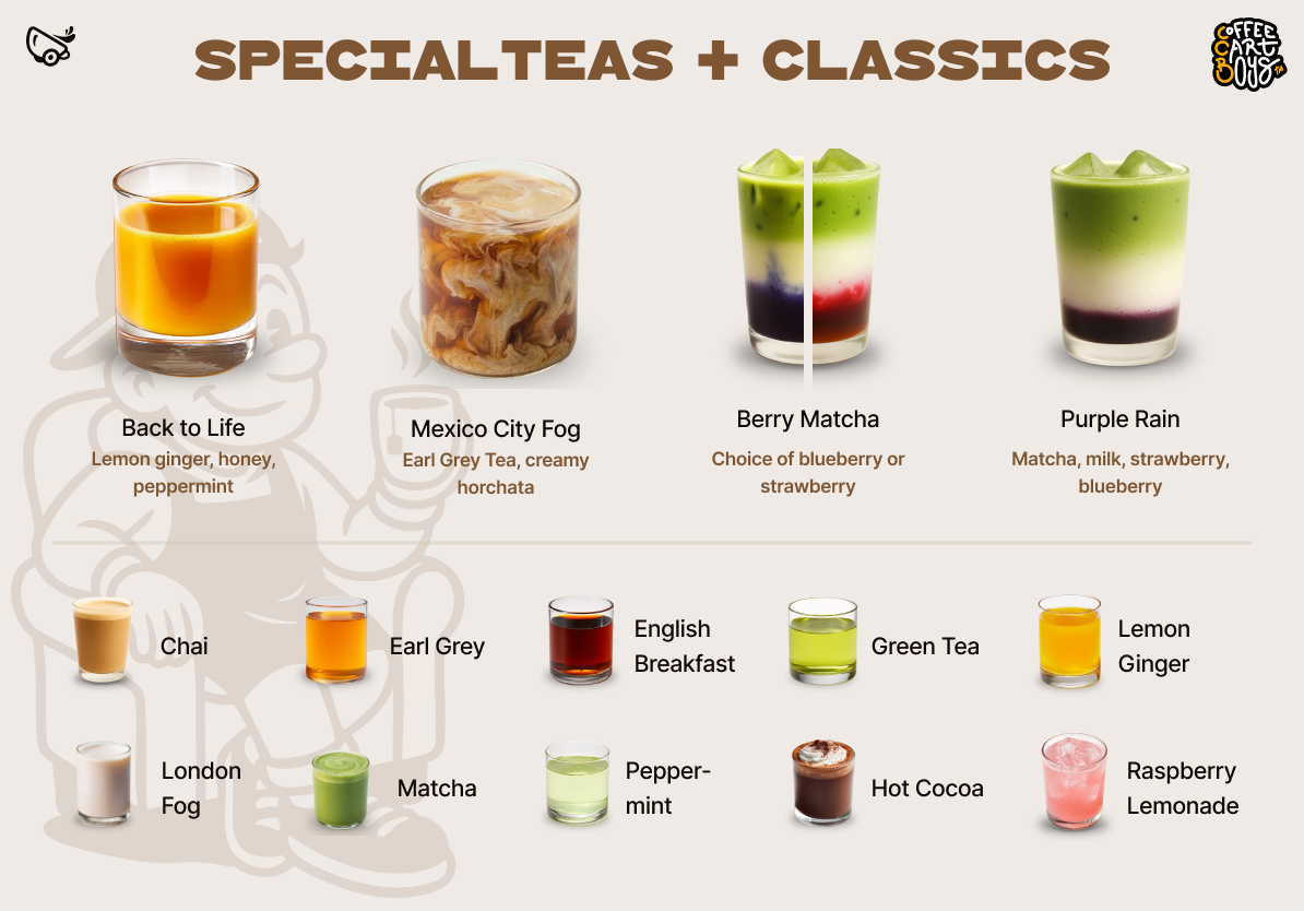
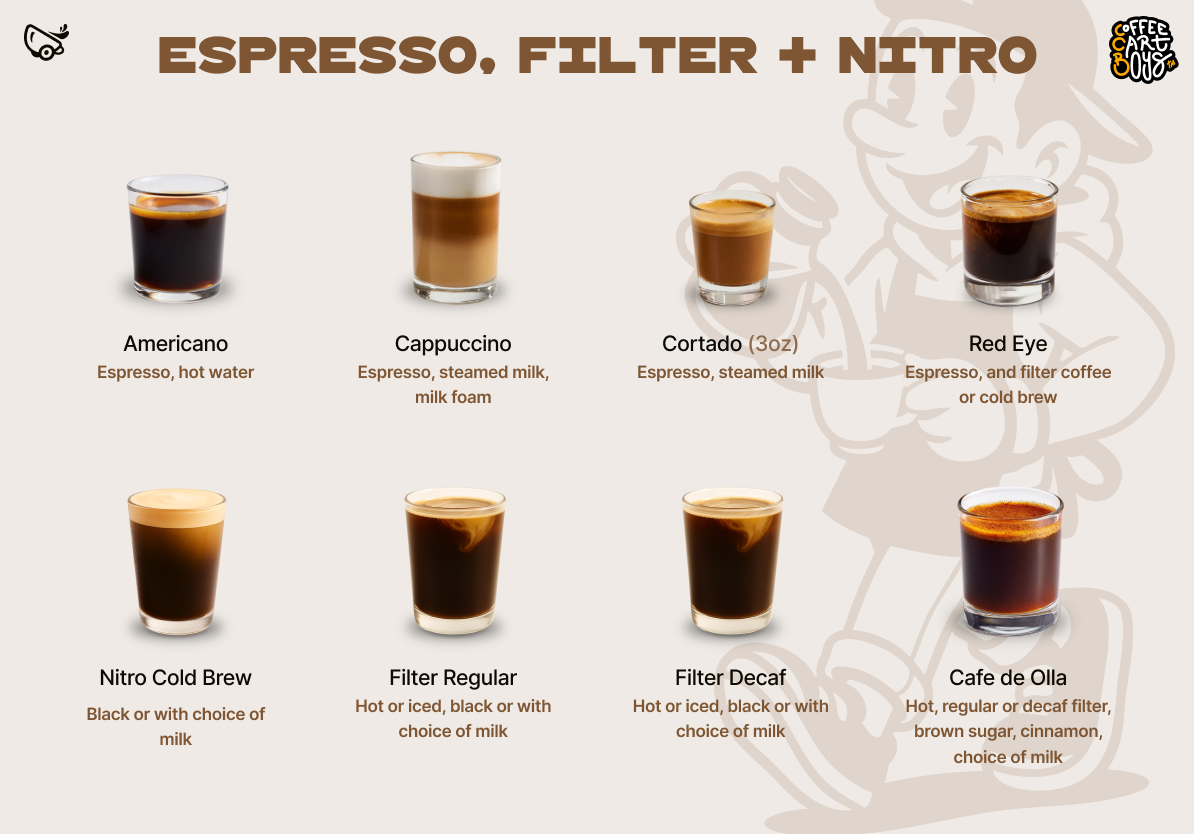
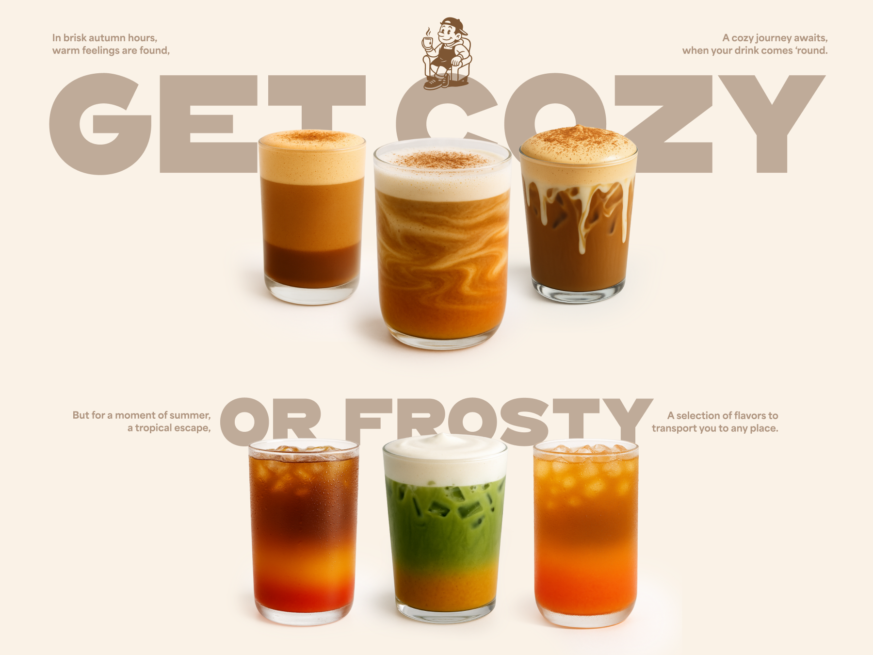
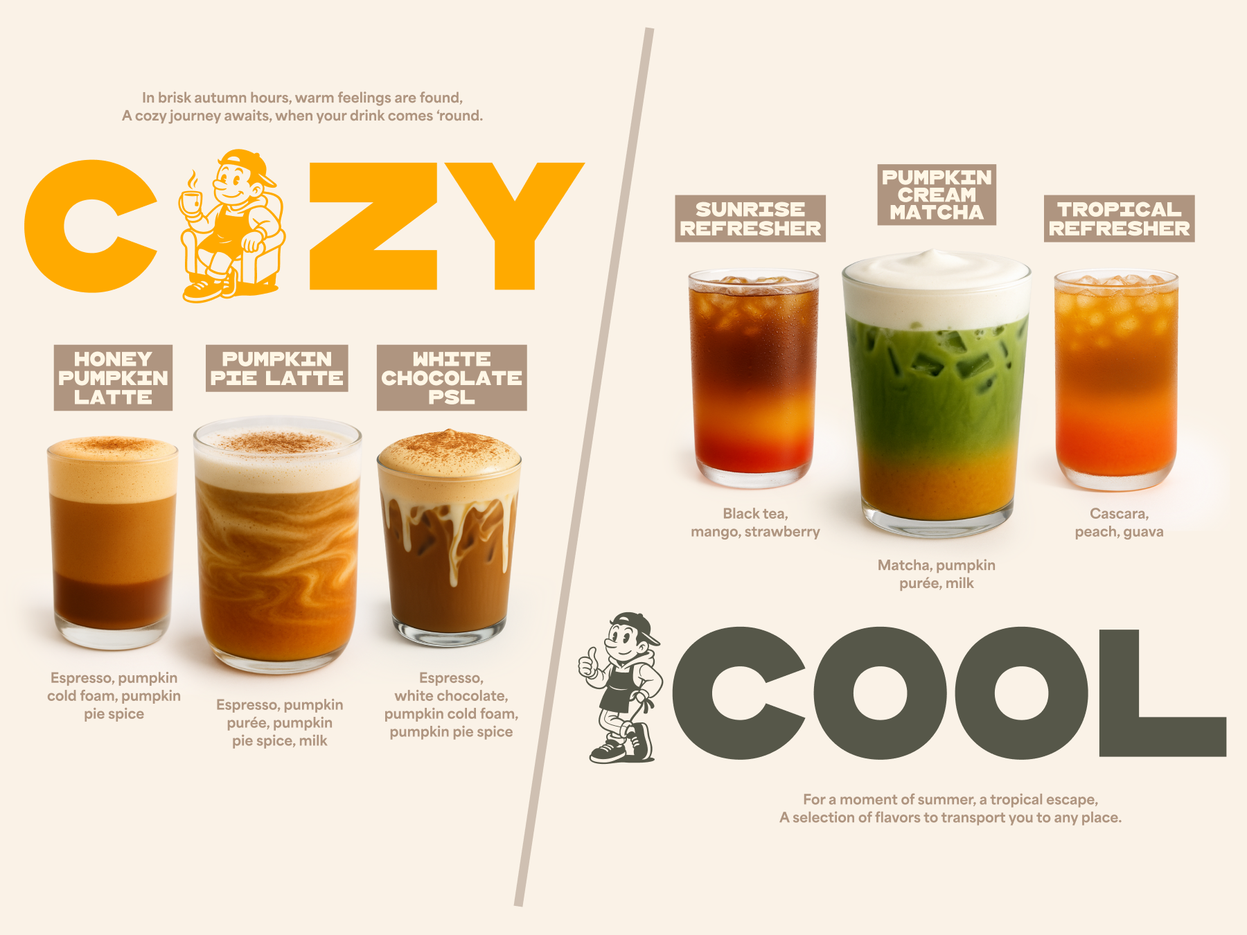
The system doesn't stop at the website — it carries through to the in-store menu boards: the same wood-type display, mocha-and-gold palette and mascot. Below: the year-round lineup, plus a bespoke seasonal drop (Fall 2025) that stretches the brand somewhere new.
Why it works
- Tokenised, build-ready. Colours, type and spacing live as named variables, so the design hands off to a WordPress/Bricks build with no guesswork and stays consistent as it grows.
- Distinctive, not templated. A wood-type display face over a clean body, dark mocha + gold — it looks like the cart, not a stock catering site.
- Designed to convert. Social proof, clear benefits, transparent pricing guidance and repeated “get a quote” paths aimed squarely at event enquiries.